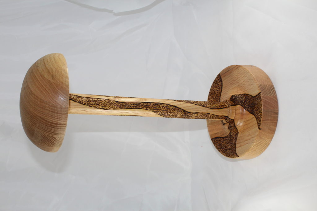
I’m still working through the stash of mulberry bowl blanks that I turned over a year ago. For this one, I tried NOT to do any kind of embellishment, choosing instead to work on the overall shape of the bowl and let the beauty of the wood come through.
I think I accomplished what I had intended, but now I’m not sure that was a good thing. As I was taking the picture for the website, I kept thinking “Maybe it needs to have some kind of segmented ring added, or maybe some kind of pattern burnt in the side… This one may not be fully finished. If that little voice in my head doesn’t shut up pretty soon, this one may be back on the lathe.
Just cant help thinking that there needs to be something added on the outside, just under the lip of the bowl.
YouTube is a sneaky beast! One minute you’re looking at a video that teaches you how to do something and they next thing you know is it’s two in the morning, and you’ve just watched your 15th straight “surprise military homecoming” video, every video from songs that were popular during your senior year of high school, or worse, your 200th cat video.
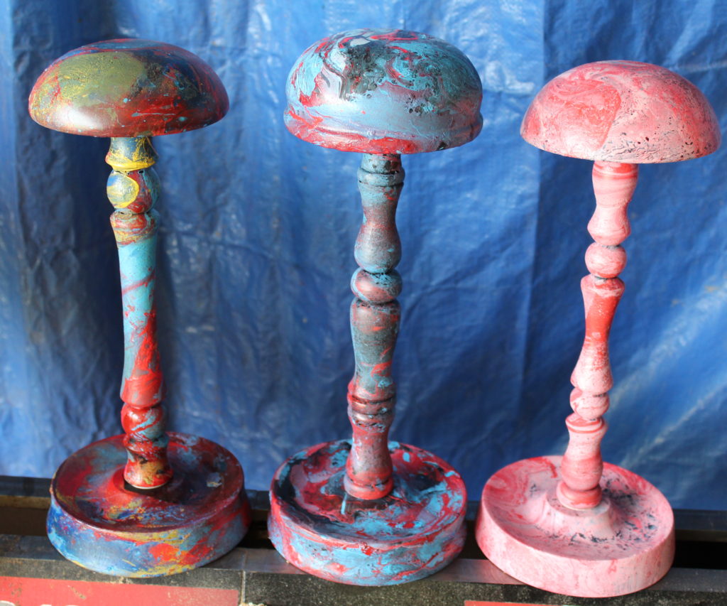
During one of these trips through the black hole, I stumbled on “acrylic flow painting”. This is a process where regular craft paint is thinned, sloppily poured together in a cup (with a few drops of silicone, if you’d like, to make “cells” within the paint), then literally poured over a piece of canvas. It is incredibly sloppy, extremely wasteful, and absolutely fascinating! Some of the finished pieces are nothing I’d hang on my wall, but some of them are absolutely stunning! I figured that was cool on a flat surface, but what would it look like on a round surface? I kept clicking… Eventually, I found people that were using this approach to paint flower pots and one guy who was using it to color bowls that he had made.
YAHTZEE!
I went to Wal-Mart for cheap acrylic paint, Home Depot for a bottle of Flotrol, the Dollar Store for some of those cheap plastic condiment bottles, and Amazon for a bottle of 100% silicone in liquid form. While I waited on Amazon’s two day shipment to arrive, I went down to the shop and hastily finished turning some small bowls that I could experiment on. Once the UPS man made his delivery, I had all my supplies in hand and was ready to begin.
The results are below. I don’t particularly like any of these, since none of them look anything like what appears when paint is poured on a flat canvas. Gravity gets in the way and everything “cool” just kinda slides down the side of the bowl and onto the kitchen table. I did learn a tremendous amount about mixing the paints, how to better prepare the bowl for accepting the paint, how NOT to apply the paint to the bowl, and how best to clean up a whole blob of messy, thinned, silicone infused paint. I will certainly try this again, but most likely it’ll be reserved for the outer rim on a wide rimmed platter, since that would be a much flatter surface.
First 4 practice piecesFor all the colors I tried to include, this one actually did a fairly good job of keeping some of the colors on the bowl.From a distance, this one looks like a muddy blue bowl. Its not until you get up close you can see all the other colors trying to peek out.
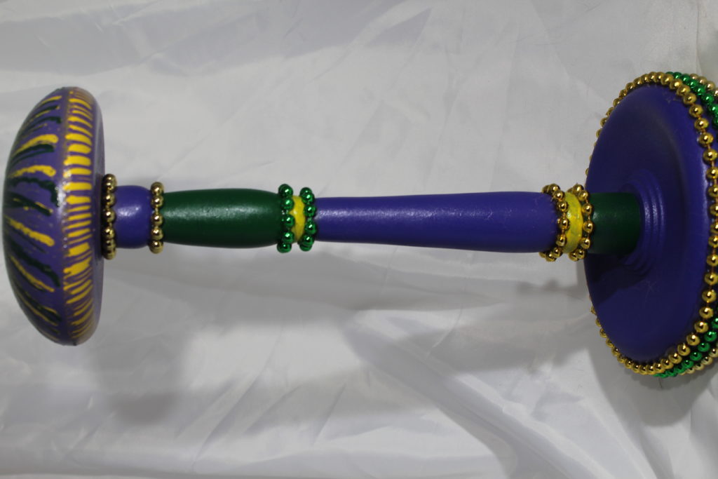
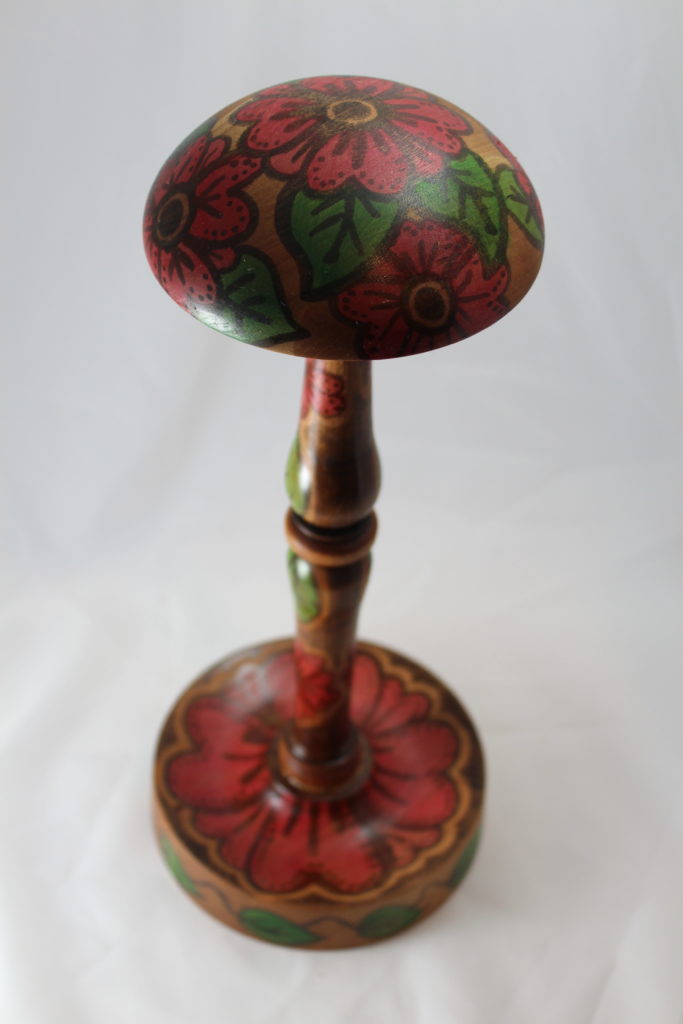
I had the TV on a week or so ago while I was working on some stuff on my iPad. NCIS – New Orleans was on, but it was really just making noise in the background. At some point, I aimed the remote at the TV to try to find something else, but paused when they started showing crowd scenes of what was apparently supposed to be Mardi Gras. I doubt it was the real thing, because the sidewalks weren’t absolutely full with stumbling drunks and you could still hear the actors talk. While I’ve never been to Mardi Gras, it doesn’t really match the footage they play every year on TV. What made me pause, was a very brief – like one second brief – shot that showed a woman walking down the street with strings of beads around her neck, holding a giant Mardi Gras themed “pimp cup”. My immediate thought was, “I wonder how that would look on a wig stand”?
Purple, green, and gold are the signature colors of Mardi Gras (representing justice, faith, and power) and from what I’ve seen, any time these three colors are put together, it has something to do with Mardi Gras. Kinda like anything painted red and green suddenly looks all Christmassy. Below is the creation. Not sure this will appeal to everyone, but maybe someone who lived there or who liked to be one of the stumbling drunks will get a kick out of it.
Oh, and the beads came from the dollar store. There were not “awarded” to anyone for specific Mardi Gras related actions…
Not real wild about how the top turned out, but the overall effect is pretty good…
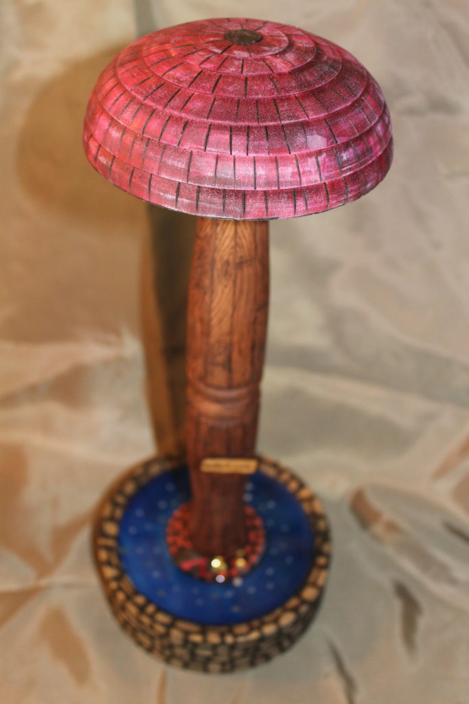
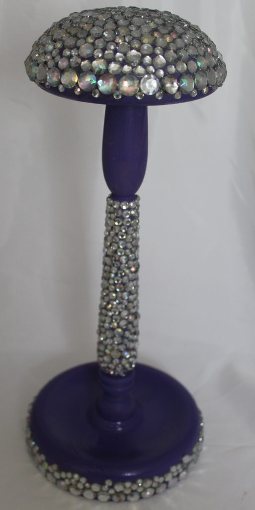
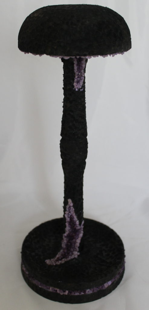
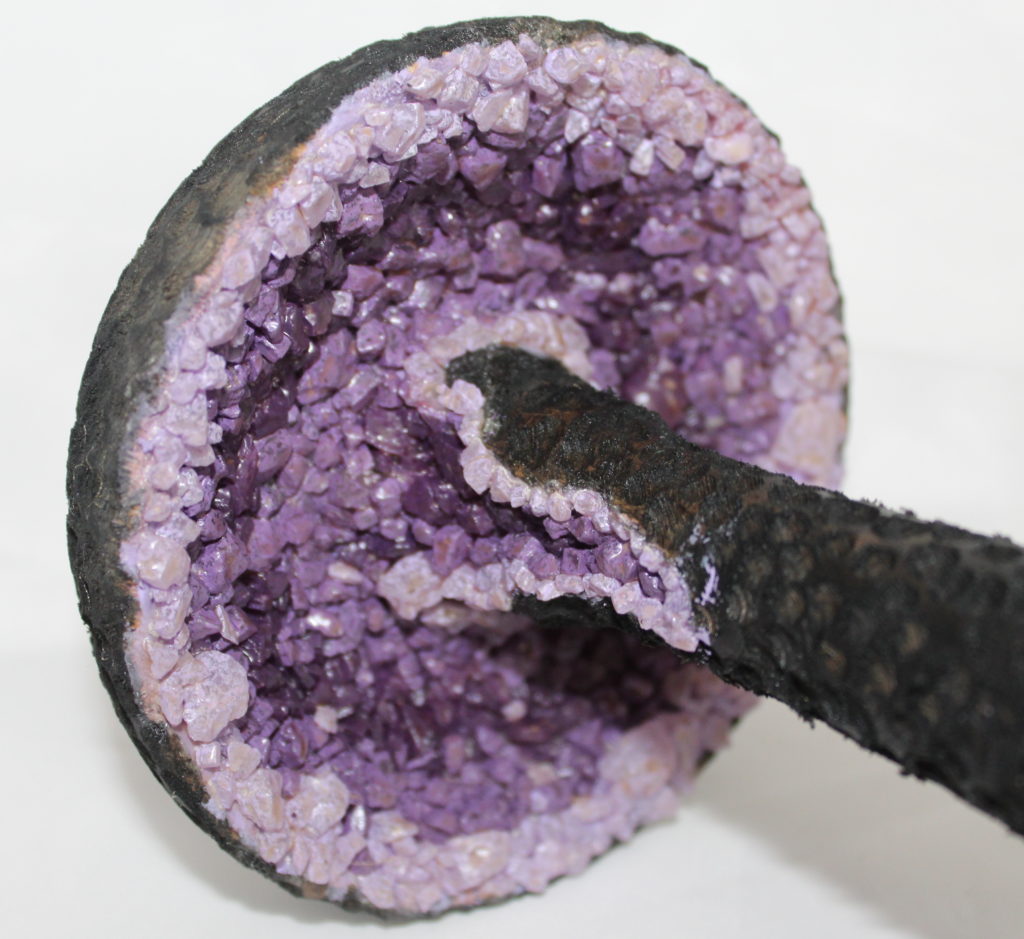
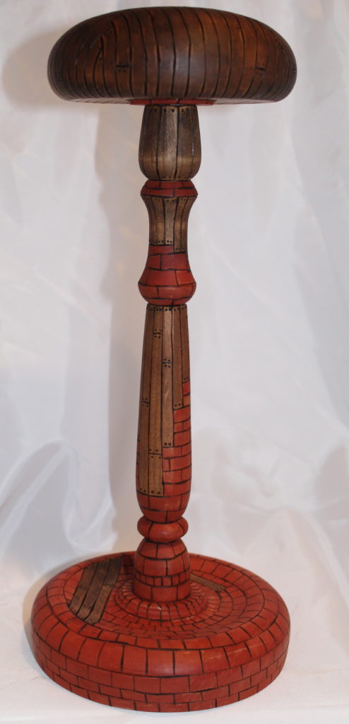
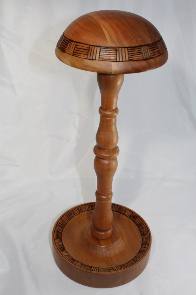
I’m getting tired of making wig stands. The actual turning part isn’t that bad, but once it gets turned, I feel like I have to do something to it to make it special. That something needs to be new, creative, and different than anything else I’ve done. Here’s my latest attempt.
Not sure what the wood is (THANK YOU fellow turner and club member Terry Quiram for turning the stand) but I think it’s some kind of pine. I decided to do some wood burning on it and couldn’t decide if I wanted to make bricks or boards, so I did a little of both. four hours later, the bricks were colored with terra cotta colored India ink and the boards were brushed with Danish oil. The Danish oil didn’t soak into the wood evenly, which actually gives it a more realistic look. It’s also somewhat translucent, so the wood grain in the stand will show through on the boards. I still need to add coat of spray on poly to seal it all, followed by several coats of wipe on poly to make it durable, but didn’t want it to look that shiny for the pictures. The flash on the pictures below made the terra cotta ink look really orange. Up close, it’s not that bad…
Hope the ladies at the cancer center like it!
Up close, the detail on the boards really shows.A close up view of the spindle work. The terra cotta color is a LOT less bright up close.I tried to make the top look like an old, caned chair.
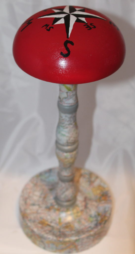
My last entry was about how two of my daughters had decorated wig stands, furthering their lifelong one-up-mans-ship battle. Well a third contestant just entered the ring and she’s a contender!
This piece was completed by Jenny, who wanted to repurpose an old road atlas that we found and even added a giant stick pin and compass rose to complete the look. I like this one!
Very solid first effort on a wig stand!
Not sure how the other girls will respond, but I suspect the remaining four kits that I have will be snatched up very soon after the turning is done. I just hope whoever gets these pieces appreciate the competitive love, sisterly bonds, and care that go into each one.
My kids have always had a sibling rivalry going, mostly because they all have both a creative streak and a competitive streak. It’s nothing new, especially between Alexa and Megan. 10 days shy of a year apart, they’ve been trying to one-up each other since they were all still getting diaper changes after their afternoon naps. Alexa jumps off the bottom step, Megan jumps off the second to the bottom step. Megan colors the best picture in her pre-school art class, the next day Megan creates the best collage in her pre-school art class. Alexa creates a fairy garden to outshine all others, Megan creates the world’s biggest tidal wave (aka garden hose) for the win. Now in their mid 20’s, this game continues, with neither knowing the actual score, but with both feeling they might need to pad their lead a bit. Their perpetual battle of “I can do it better than you” isn’t unique, just ask any parent of multiple children. They’ll just smile a knowing smile, nod their head, then wait to hear if the ending of the story involves an visit to the emergency room.
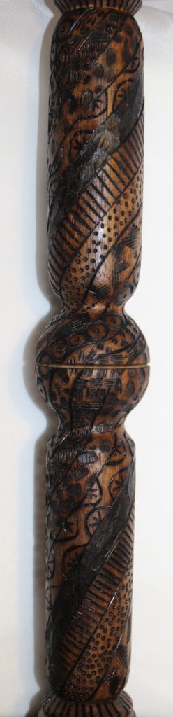
Wig stands have become the next zone for competition. Megan started it with this henna design inspired black and white number that completely amazed my turning club. The recipient of this stand sent a very nice note back to the turning club, praising the artist who made such an intricate design. +1 to Megan.
all the design was done freehand by my daughter, Megan.
Then Alexa jumped into the sibling rivalry with a wig stand decorated with flowers using different colors of wood stain. Again, the club was extremely complimentary and this stand was mentioned in a news paper article quoting one of the cancer patient recipients. Alexa for the tie!
Start with cherry, paint in some walnut stain, some red flowers with a little greenery and this is what you get. Beauty!!!
Well, Megan (masterfully using the geographical advantage she has over her sister) has upped the ante with her latest addition to the unannounced, but harshly judged competition. This henna inspired design wasn’t done with paint and a marker, this time she chose to use the wood burning tools and let the natural color of the cherry wood be the background. NICE!
LOVE the design on this one, especially since this was the first time she has used a wood burner.
By my count, that could put Megan up one point, however, that could be a very short victor lap because there are about to be other siblings weighing in. Emily, Jennifer, and Courtney all have stands in various stages of completion, so I suspect the field of combatants increase. I’m sure there will be more to come!
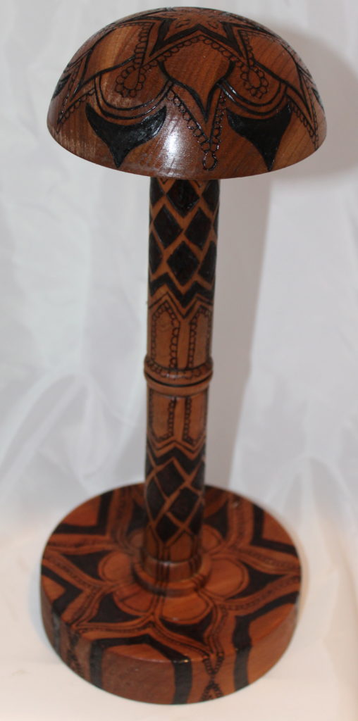
I turned a wig stand out of walnut, but didn’t want to turn it in without adding some kind of embellishment. Since I think it should be illegal to paint over walnut, I decided that I’d add some kind of pyrography (aka wood burning) to make it better. The trouble is, I’m not all that accomplished at pyrography, so I needed something that would be relatively easy to do and relatively easy to hide mistakes. If I tried to make something people would recognize, like a wolf or a deer, it could easily end up looking like a survivor from some kind of horrible automobile accident. I had this immediate flash of a woman going through cancer treatments, looking down at the wig stand and trying to decide if that thing on the top was a dog with a broken snout, an aardvark with mange, or the mythical chupachabra.
That’s when I discovered a specific type of design called zentangle. Yeah, that’s a real word! While it looks like doodling, that’s apparently a pejorative term for zentangle artists. Reading about the two, it reminded me of the Twix commercial comparing an undertaker to a mortician, a janitor to a custodian, or a ghost to a spirit. Yeah, they may be different, but no one’s gonna notice…
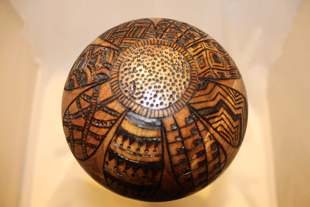
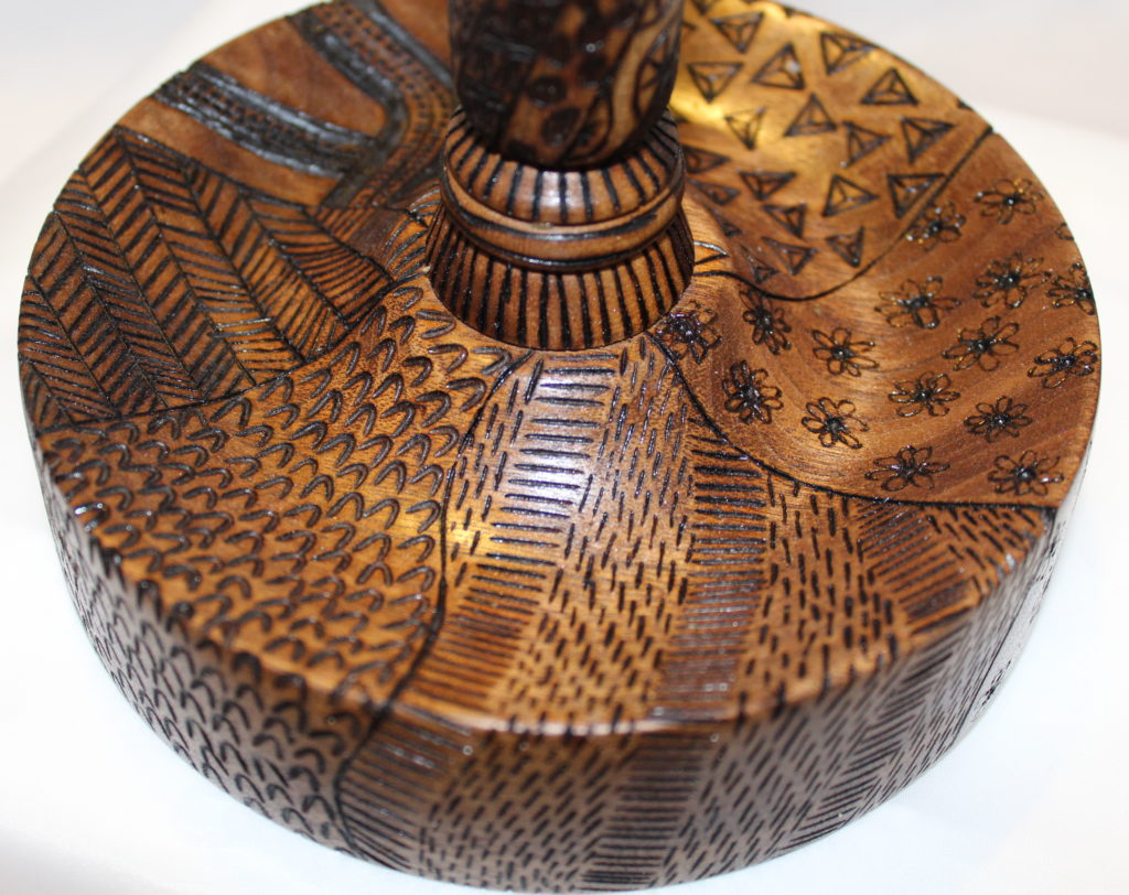
Here’s the effort, but to get the detail, it has to be multiple pictures. Hope the cancer patients like this and recognize the hours and hours it took to burn that many lines, shapes, and shadings into the wood.
With Zentangle, design, separate spaces are made, then a unique design put only within that space.From the top, this is supposed to be a flower, with zentangle petals..Each of the “lines”, twist around the spindle.
The president’s challenge for my woodturning club this month is something with flowers. I suppose that’s to make everyone feel all spring like inside. So far, the projects that have come in have been pretty standard as far as people either making some kind of wooden flower, or painting a flower on another piece and calling it a day. I’ve had a project in my mind for awhile now, but didn’t really have a reason to try it, so I figured this challenge would “force” me to try.
My thought was to see if I could mimic the look of stained glass on a woodturning project, by using colored casting resin. How hard would that be, right? All I’d have to do was carve out where I wanted the resin to go, pour it in there, then let it dry and finish up the turning. Easy-Peasy, lemon-squeezy!
No. Not easy, no peasy, and nothing the least bit squeezy, lemon scented or otherwise. There were only problems.
I chose a bowl blank of red oak, which is about the least carvable wood there is. That’s on me. To fix that, I turned the outside shape of the bowl, then cut the top off the bowl blank and figured I’d just use a jigsaw to cut the pieces out of the thin, flat top, instead of carving them all into the blank.
The jig saw work was pretty uneventful, except I realized that the pattern I was using wouldn’t look the least bit like stained glass when the resin was poured in. Since there was no lines between the individual petals, it would just look like big colored blobs, so I decided to only to the tips of the flower petals, make a circle to fill in for the middle, then use a woodburner and dye to do the rest of the petals.
When I went to put the lid back on the bowl, I realized the bowl blank wasn’t all the way dry. Why is that a problem? Well, in the ten hours or so that the “lid” was off the bowl, the lid warped AND the bowl warped, really bad. When it came time to glue the lid back on, there was suddenly an 1 1/4″ gap between the two. I figured out how to use the tailstock from the lathe to press it back together, but right as it was about to fully compress onto the top of the bowl, there was a loud crack. I’m not exactly sure where the wood broke, because I can’t see it anywhere, but it’s there somewhere, just waiting for the humidity to drop down so it can split in two.
The casting resin didn’t want to cooperate, either. No matter how much I taped the bottom of the holes, there always seemed to be a little bit that seeped out. Some started leaking in a couple minutes while the resin was still wet, but others waited until I had turned the lights out before making their escape. When I went to do the sanding, I saw the dimples in some holes and empty sockets in the others. I refilled the empty holes, but didn’t have the will to go back and fix the dimples.
There isn’t an even surface on this thing! The top has several waves where the wood warped, and the actual outside shape of the bowl is actually oval, not round, because of how much it had warped. All of the final sanding had to be done by hand, so it’s only sanded to about 220 grit. There are spots on the outside end grain that could pretty much grate cheese.
I was so done with this bowl by the time the glue dried on the lid, I actually forgot to go back and add the wood dye to the flower petals, so these are the worst looking flowers that never grew in real life. Ick! Just ICK!
End the end, I’m hoping this will at least stay in one piece until the next club meeting, so I can get credit for having completed the challenge. Beyond that, it may just have an “accident” on the way home from the club meeting. I could easily see it get caught in a crosswind as I roll the window down, sadly being sucked out of the car at the exact moment I’m going over a bridge with a fast moving river below…
Here you can see the epoxy dimples in all their splendor.The shape of this bowl would have been good, except for that obvious warping that can be seen here.
Remember when you were little and played with that little plastic contraption that spun a piece of paper really quick and you could drip paint on the paper and make these really cool designs that looked like the paint just exploded out from some unseen explosion in the middle? Yeah… Me either. My parents seemed to instinctually know that getting me one of those things was a really, really bad idea. Looking back, I can’t really say I can blame the for the harsh judgement. Well the joke’s on them, though, because a mere 45 years or so later, a guy brought a bowl to a club meeting and taught me that a lathe spinning at a couple thousand RPM’s is like a giant sized version of that little plastic toy, only turned sideways to make a MUCH larger spatter zone! SCORE!!!! Look who did it anyway, Mom!
Dave Bloom brought in these small(ish) bowls he had made on his lathe, with the colors running from the middle. His method was painstaking, calculated, and detailed. He used a hypodermic needle to carefully apply just enough paint so that the line would be made, but not so much that the ceiling, walls, workbench, tools, and overly trusting small animals would not be covered. Well, nuts to that! I duct taped a 10″ wide ring of cardboard from an empty case of beer together, put it around the wood where I guessed the splatter zone would be, then got out the spray paint and let’r rip! In all, there are four different colors of blue, a healthy dose of white that blended itself with the blue, and some silver metallic spray paint that won’t blend with anything.
I think I’ll keep this one, at least for now. I also noticed that the local Wal-Mart store has spray paint on sale…
I really like the overall look of the top of this, especially the way the colors blended themselves.It’s a little taller than I had envisioned, but that makes it a lot more stable.Here’s a close up picture of the colors.